


The fashion industry has benefited from the mobile shift on an unprecedented scale — social media generates immense traffic that can be turned into user engagement and sales. Today, I speak with Sveta Havaka, eCommerce UX designer, about creating online stores for mobile commerce, taking the user-first approach and designing progressive web apps.

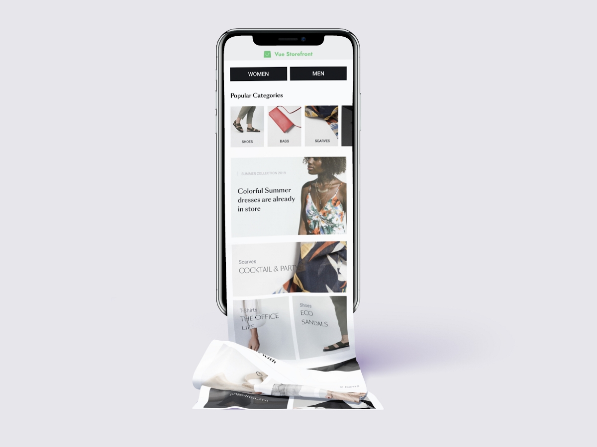
Sveta, only a few days ago you won the second prize in the Alokai Demo Theme competition. Your winning theme presents a fresh and colorful design, ideal for any fashion brand, but it also speaks to the ongoing mobile revolution. It is designed as an eCommerce PWA theme and can be used both as a webpage and mobile app.
Why did you decide to take this challenge and design a theme for an eCommerce progressive web app?
I have been working with progressive web apps for quite a while now and have become a big fan of them. I understand all their pros & cons and know how to get the most out of them. PWAs are super fast, convenient to use and extremely engaging. Everything is in the name itself — “progressive”! And what I like the most, is that PWAs have the ability to give users an excellent app-like experience, and I certainly did take advantage of it in my project.
You work in the product design team and create solutions for eCommerce on a daily basis. What makes your design unique? Are there any UI and UX principles that you followed while designing your theme?
What makes my design particularly unique and different from many others is the non-distractedness. I have faced the task of making the design easy to adapt to any brand, yet made it clean and beautiful, allowing to keep the uniqueness of each brand. I have made the most of non-distracting design that, first and foremost, focuses the user on the product itself, and only then on everything else.
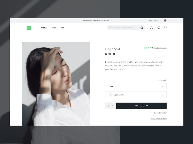
It is worth mentioning that the theme is done completely according to the Google PlayBook which is based on case studies of market leaders like Mango, Sephora, Warby Parker, LYST and many others.
How do you approach designing user-oriented solutions?
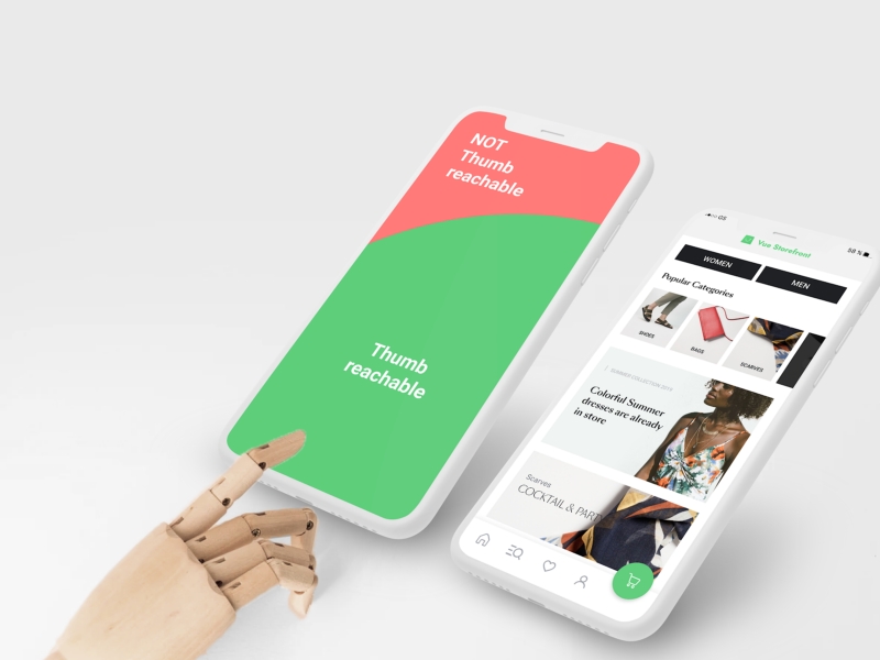
While working on any solutions, we should take into consideration all the obstacles of the user flow. Where is our user going to use the app? In the car, his/her kitchen while cooking, or maybe hiding under the table while in a business meeting?
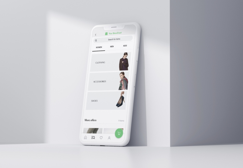
Usually, people use their phones on the go, holding a phone with one hand which tells us where to locate the main CTAs and important links. Hence, I put the cart down the screen so it will be easy to reach; the menu, search, and personal office are also located at the bottom — the most convenient place to reach with one finger. Secondary links I have located on the top of the screen.
Top categories on the home screen and social proof help our users to find the right product fast. The dynamic menu allows for a better visual hierarchy. The value proposition at every step of the flow frees the user from the need to go back and forth between the same screens. Guest checkout saves time. Checkout pagination simplifies conversion flow.
What are the biggest difficulties in PWA design? How did you overcome them in your theme?
What is important to remember while designing progressive web apps is that after saving a PWA on your home screen, there are no browser functionalities to help our user to navigate around. I was always keeping in mind the need for proper navigation to overcome this challenge. As a result, in my theme you can see easy-to-use top and bottom navigation bars with an expanded search box.
Another thing to keep in mind is modern users’ desire to share content. No need to stop them from doing so. That’s why social media and other sharing options should be easily accessible ;)
Tell us more about the design process. Did you try to solve any particular problem or answer new trends?
From the start, I took an entirely mobile-first approach. I imagined that I was designing a native app. For me, designing PWAs is much closer to designing a native mobile app than a responsive web app (although PWA technology combines these two in one). Such an attitude gives my design a more “appy” feeling rather than “webby.”
Another step was proper research on current trends and case studies. There are many great companies facing certain challenges and successfully finding solutions, so why not learn from them? For example, by replacing the search icon with a search box LYST increased usage 43% on desktop and 13% on mobile. It simply helped the user to easily notice the search — something which I used in my design with great pleasure. The same company experienced a 17% increase in CVR by using an urgency motivator on the product page.
Doing proper research on what today’s user expects from our service, and learning from our competitors (both pros and cons), are the key elements in any design challenge I take.
It is also crucial to remember everyone in the developer’s team. There are often moments when the designer wants to do something out of this world. However, keeping in mind developers who are going to struggle with implementing all the crazy designer’s ideas helps to cool down :)
Why did you decide to design the theme for fashion eCommerce? What features are especially useful for this sector?
I work in an eCommerce software house and, observing our clients, I can say that the fashion industry is in the biggest need of improving its mobile touchpoints. Due to the mobile gap, this industry is losing revenue, and progressive web apps have many features that can help here.
In the case of my PWA theme, I think the most useful features are:
- A properly designed checkout process — this is where eCommerce usually loses its users. A fast checkout divided into easy to follow steps is the thing to start with. Don’t forget to allow guest checkout and limit exit points while having the conversion flow only let the user go to the homepage or contact support.
- Trust and confidence features — make sure to secure the user by including security certificates and a privacy policy.
- An easy-to-locate shopping cart — the best position is just under the thumb’s reach.
- Value propositions included at every step of the user flow — I didn’t stop on the product listing and neither should you.
Ok, to finish up, let me ask you about your favourite features in this theme. Which ones do you like the most?
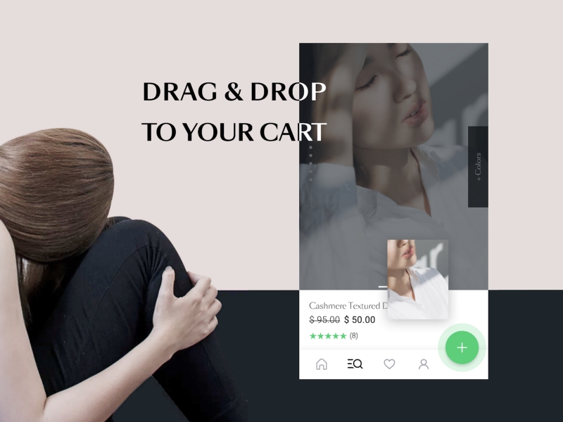
Ummm, I’d say drag and drop to the cart, which does not only speed up the process of shopping by using the exceptional mobile potential but also adds a feeling of “gamification”, making the buying process fun.
Another thing I love is the slight difference between the desktop and mobile versions. In order to help my users to find a product to fit their needs, I created clear CTAs and located TOP Categories with dynamic menu blocks at the top of the mobile homepage.
Thank you for reading. If you are curious about designing progressive web apps, you can reach out to Sveta Havaka at Dribbble. The theme presented in this interview will soon be available on the Alokai webpage.


.png)

