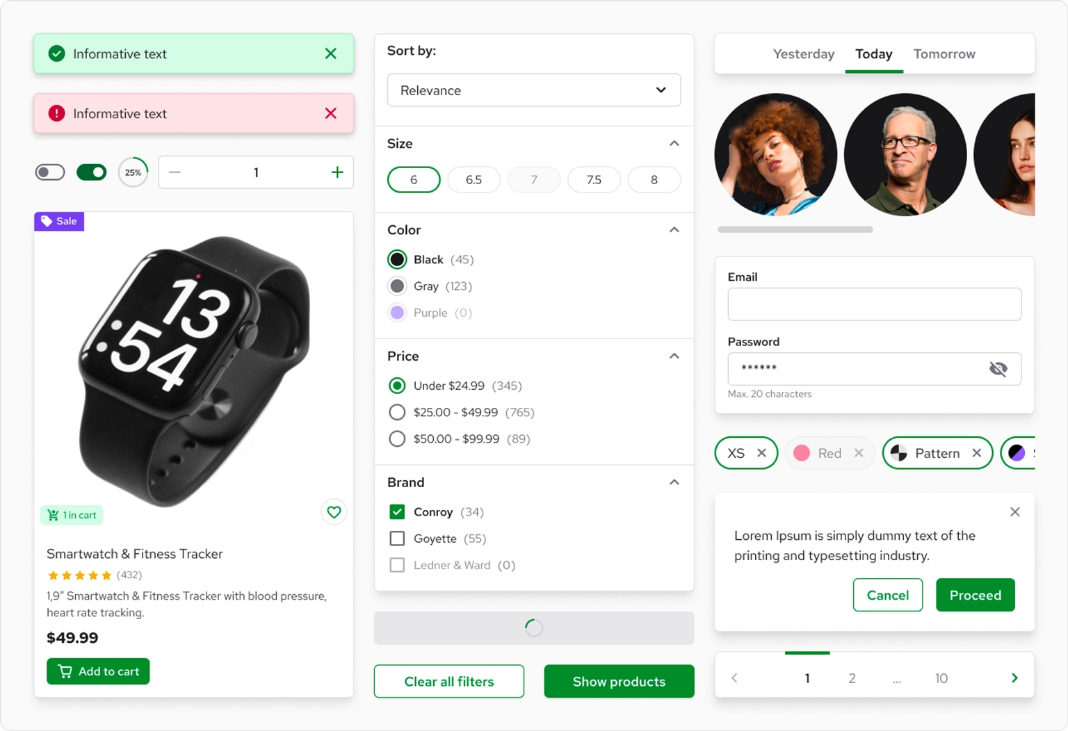
Four years ago, we introduced Storefront UI - a cutting-edge UI library and Design System tailored specifically for eCommerce. Our goal was to empower users in creating stunning, swift, and scalable user interfaces. Today, we're excited to announce the launch of Storefront UI 2, a revolutionary update compatible with both Vue.js and React! That's right - we're now supporting REACT as well! Experience the next level of eCommerce interface design with Storefront UI 2.

Why we built Storefront UI 2
Since the launch of Storefront UI 1, the landscape has evolved significantly. The headless market has expanded, with Composable leading the way in the enterprise sector. The methods for building and composing UIs have shifted, primarily occurring in Content Management Systems now. Furthermore, our understanding of your challenges has matured, prompting us to re-envision Storefront UI and tailor it to modern eCommerce Storefront development.
I must admit, I’m incredibly excited about this launch. Our team devoted countless hours to perfecting the Developer Experience, documentation, and quality of the new Storefront UI components, ensuring they meet the demands of even the most discerning developers. We made a promise to deliver the best Developer Experience in the market, and Storefront UI 2 is our first step in fulfilling that commitment. With an unwavering focus on Developer experience and attention to detail, we’re confident you’ll love the new Storefront UI 2.
React support is here!
If you subscribe to my Newsletter, where I share a lot of behind-the-scenes info, you know that one of our goals for this year is to become a framework-agnostic product. With Storefront UI 2, we are one step closer to accomplishing this goal! Take our Middleware, integrations (did we mention that they now work with any framework?), and Storefront UI to build your storefront with any stack using Vue or React!
What problems does Storefront UI 2 solve?
Like any UI Library / Design System, the main goal of Storefront UI is to accelerate the development process by providing an opinionated set of premade components, utilities, and patterns.
Building exceptional user interfaces involves addressing numerous considerations, such as:
- Developer/Designer workflow: Storefront UI comes out of the box with Figma files - a pixel-perfect representation of your code that your design and engineering teams needs to stay aligned.
Performance: Poorly written and overcomplicated components are often the performance bottleneck ruining the experience of your users. All standard eCommerce pages that we've built with Storefront UI hit 95-100 on Lighthouse ! (mobile performance measured using PSI) Accessibility: Web Accessibility is more than an ethical requirement in US: it’s also a legal requirement and you risk fines if the justice department finds you guilty of non-compliance. Creating accessible components can be time-consuming and necessitates specialized domain knowledge. Fortunately, Storefront UI components are WCAG AA compliant out of the box, saving you time and effort!
But let's be honest, almost all established UI libraries can solve that. So, here's what Storefront UI is absolutely best at:
- Customization: Many UI libraries out there fail when components need to be heavily customized. You suddenly find yourself working against your library to achieve the desired look. Storefront UI is built for complex cases. We ship a set of small and flexible base components like Button, Checkbox, or Modal that can be used to build more complex ones. We also deliver more complex examples (aka Blocks) like ProductCard or various checkout steps as copy-pasteable code using Storefront UI components and Tailwind utilities.
Moreover, Storefront UI seamlessly adapts to complex UI setups, making it ideal for situations where a single library is inherited and customized by multiple projects with distinct visual requirements.
- Scaling: The more your application grows the less maintainable your UI becomes. By providing the right building blocks and using Tailwind CSS we made sure that your UI will be easy to maintain and won't negatively impact your performance even on large-scale projects.
Focus on eCommerce: Storefront UI comes out of the box with components specific to eCommerce like ProductCard, QuantitySelector, and even checkout components!
What comes out of the box?
Our goal is to lay a solid foundation for your custom Design System and UI library by handling the repetitive groundwork. This allows you to concentrate on creating distinctive elements that set you apart from the competition.
Storefront UI comes out of the box with:
- Base Components - beautiful, fast, and fully accessible components like Input Checkbox Button that you can use to quickly build more complex structures
- Blocks - complex, copy-pasteable examples like ProductCard or checkout steps.
- Composables / Hooks like useDropdown that abstract complex UI interactions
- Tailwind preset that maps tailwind config to CSS variables and provides few SFUI-specific defaults
- Typography package simplifying usage of 3rd party fonts
- Figma file with a pixel-perfect representation of SFUI components based on tailwind properties
Try it out!
Learn how we’ve built Storefront UI 2
I cannot emphasize this enough: Open Source is more than just code; it's a mindset. Throughout the development of Storefront UI, we've gained invaluable insights that we're eager to share with you. In the coming weeks and months, anticipate articles exploring the various challenges we've faced. For an even deeper understanding, don't forget to subscribe to our monthly Developer Newsletter, where I share exclusive VSF insights you won't find anywhere else!


